Branding Basics
Colors
Colors are pretty important to the company owners and marketing teams. Color theory is a whole other topic to learn about, but people tend to subconsciously relate colors to meaning. Colors can be part of your brand story. They are also the first step in brand recognition and brand awareness. Think about Coca-Cola, McDonald’s, or Facebook you likely can visualize their logo, fonts, colors and maybe even their slogans.
If I was to show you a color that is slightly adjusted in hue, tint or color, you would likely be able to tell me it’s not the right shade for that brand. While those colors give us emotional cues, they also have built a way for us to recognize them in multiple formats. From printed coupons, billboard, shirts, and phone covers, a branding guide was given to ensure the correct color codes were used.
Fonts
Fonts are one of the unsung heroes of a style or branding guide. It’s a fairly current trend to use more than one font on your printed materials, website, and logo. If you aren’t using the same fonts and the marketing asset they are assigned to, you can look pretty questionable. Here is an example of a logo not using the correct font and how it completely removes the brand’s well-known identity. If someone was selling a beverage with this logo on it, you’d question its quality.

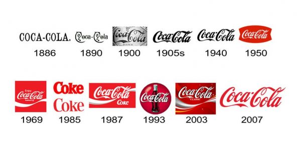
When rebranding and selecting a new font, many companies make slow changes over time. Once again, Coca-Cola is a prime example of this. You can also see companies like Amazon, FedEx, and Facebook making gradual changes as well. Here is a fairly common timeline for rebranding with color changes and font adjustments to meet the changing trends of consumers:

Branding Specifics
Logo Dos and Don'ts
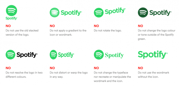
This is where it can get a bit more specific and even technical. Many logos have a couple of ways they present themselves. Usually, there is a vertical rectangular version, a squared version, and then guidelines for working with other brands. If the logo should only appear with specific background colors, the guide should state that. Many logos have a colored version, black and white, and then a gray-scaled option. If the colors are allowed to change in your logo, this would be the place to show and state it. Spotify’s business branding guide is a great example:

Messaging, Voice, and Tone
Messaging guidelines is something that we struggle to help business owners understand. It is something that should be absolute within your branding guide. If you are planning on working with partners, sponsors, or resellers, they will need to know how to represent you correctly. Are they allowed to use colorful language while talking about your brand? Should they always speak with a professional tone? Can they be creative when discussing your brand in public forums?
Imaging Guidelines
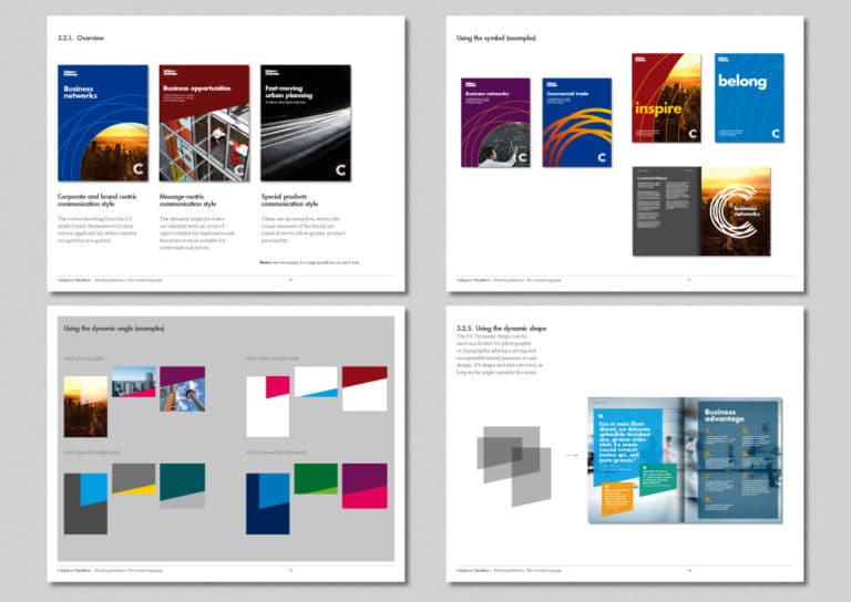
Imaging can be extremely impactful, especially when the wrong image is used. Again, if you are planning on working with partners, sponsors, or resellers, they will need to know how to represent you correctly. While you can provide creators with images, like the example below, you can also list guidelines. If you are an architectural business, maybe you only want images that contain empty buildings. If you are in the medical field, maybe only HIPAA compliant images.

Providing a Branding Contact
This seems like a basic, but everyone forgets to add it. Please list a contact email for creators to contact you with questions. Often, you will assume you have covered all your bases and then the edge case happens. If you are allowing creators to use your branding within social media or their own website, this is a must.
Template
Here is a pretty nifty template to get you started in the right direction. While I touched on the main parts of a branding guide, this template will help with the rest.
We're Here if You Need Us
Should you need help creating a brand, rebranding, or making a branding guide, we’re here to help. You can head over to our contact page or schedule yourself for an online consultation for free on our Calendly.


