Dullnig Ranches

A Custom Real Estate Website Since 1999, Robert Dullnig has individually sold over 810,583 acres and has been a consistent Top 5 Producer in the State of Texas for the past 12 years. In 2021, Dullnig Ranches hit a company record in sales volume totaling $414 million. Visit the Website Dullnig originally purchased their website […]
Best Custom Getaways
A Memorable Logo Design and Brand This logo design for “Best Custom Getaways” showcases a vibrant and dynamic visual identity that encapsulates the essence of travel and relaxation. The central icon of the logo design—a combination of a sunset, waves, and a palm tree—creates an everyday representation of a coastal getaway, appealing to those seeking […]
Firstmark Credit Union
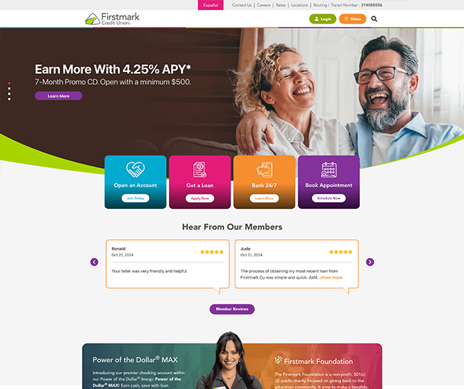
Firstmark Credit Union works on Improving their members’ lives through superior financial value and inspiring service. As a part of their value promise, they asked for a website that is smart, UX driven, and secure with some added flair that users don’t usually see in banking website designs. We wanted to create a website that […]
Alamo Architects
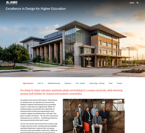
A Streamlined & Updated Website Design Alamo Architects is a San Antonio architecture firm that prides itself on listening and collaboration. They are also known for their unique designs and ability to create community spaces that leave an impression. Our goal for this website redesign was to create an engaging, eye-catching look to properly show […]
TX Fame
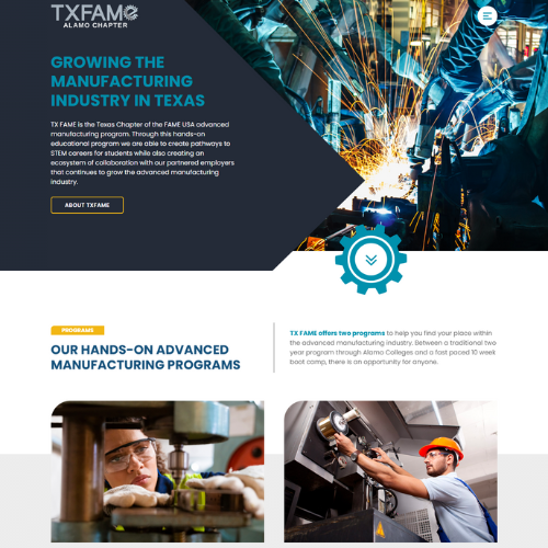
A Manufacturing Website’s Redesign TX FAME is the Texas Chapter of the FAME USA advanced manufacturing program. Through this hands-on educational program we are able to create pathways to STEM careers for students while also creating an ecosystem of collaboration with our partnered employers that continues to grow the advanced manufacturing industry. visit website Customizing […]