No matter if you are happy with your current website or looking to update, it’s important to know what web design trends and standards are happening. Some changes can impact older sites over time that not only will drop their user experience scores but can also give you the cold shoulder from Google.
2021 has brought in a lot of new trends so we picked out a few of our favorite ones.
The 2021 Web Design Trends We Love
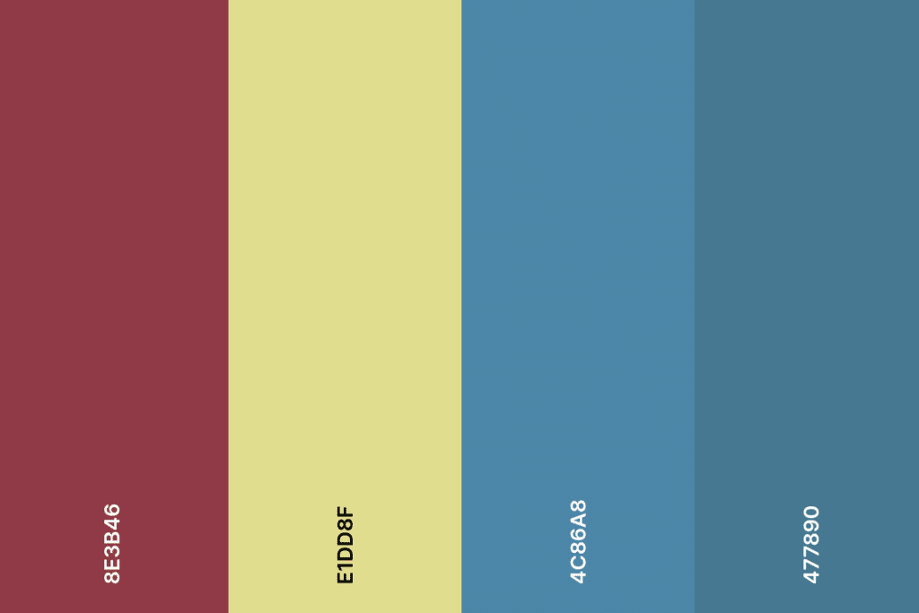
Muted Colors
For fans of minimalist design using muted colors is a great way to bring a little more life into your website. Adding colors into a black and white design allows for depth to be added to the page without disrupting the core design. Stacking two muted colors of similar families, such as a dark muted blue on top of a lighter muted blue, adds a noticeable contrast and sets up a hierarchy for the users.
Muted colors have come to represent many things as this trend has gained popularity. People see muted colors and think, modern, contemporary, and progressiveness. However, as it always is with colors and color theory, each specific color also holds a different meaning to users. Certain shades, such as the muted green background of Windows 98, can make your website look outdated. So take some time and care when it comes to selecting your colors- muted or not.
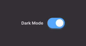
Light/Dark Mode
If you own any tech device or frequent any app you have noticed the wave of being able to pick between light and dark modes. We are now starting to see this trend make its way over to web design. This opens up a whole new idea of designs based on the user’s preference. Having a dark mode adds some extra practicality to your site as a dark mode can reduce eye strain. Whereas for design it helps your website look more modern and can help certain elements of a website really stand out.
There are two very important things you need to consider before you implement a dark mode on your website. First, make sure that you test out both light mode and dark mode. The designs need to be consistent and not jarring to users that switch between them. You don’t want users to think they have been sent to a completely different website when they toggle. Secondly, don’t forget your audience! Younger users are very used to this sort of option. While older users aren’t as familiar with light and dark modes and won’t know or even want to use them.
Cartoon Illustrations
We’ve loved cartoon illustrations for a long time and are really excited to see this become more popular. Using illustrations on your website in place of stock photos adds a lot of extra personality to your company and brand. If users have been shopping around they are bound to see the same photos used by different businesses. Cartoon illustrations can help your website stand apart from competitors.
For companies that offer services that aren’t tangible things, this is a wonderful way to have users understand what you offer. You can translate hard to see or understand products in a way that’s more human. Be careful though with how many illustrations you use, you wouldn’t want to make your target audience think that they aren’t where they need to be.
Scrolling Transformations/Animations
The world of scrolling has become a little more adventurous in the last few years. Parallax backgrounds are very common in web design but we’ve noticed a new trend very recently. Scrolling transformations and animations add extra movement while making your users feel more interactive with your website.
These animations can range from something as small as an image moving alongside the user as they scroll to transitions to a new page. We love this trend because it offers a lot of personalization with what companies choose to animate.
Text-Only Hero Images
This trend goes hand in hand with the recent push for minimalism in web design. All-day users see the same large hero image as the first thing that greets them on a webpage. In order to stand apart from competitors, websites are straying away from the traditional large image to text-only hero images. By selecting bold and beautiful typography to be the first thing users see as a page they can point out the more important information on the page or hook users into scrolling more.
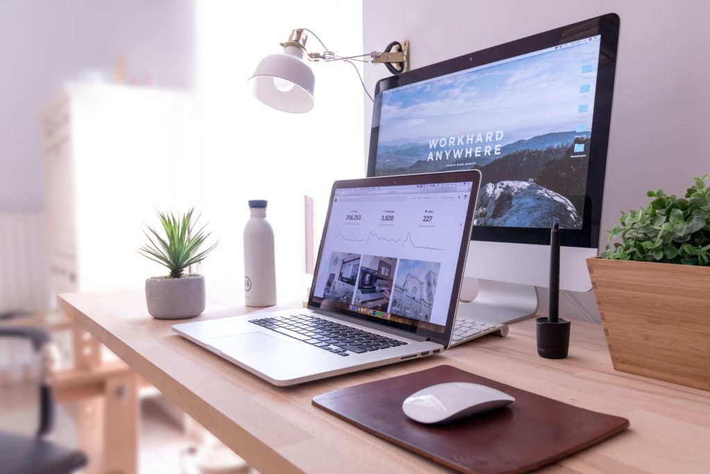
The Web Standards Of 2021 You Need To Follow
With Google constantly pushing out core updates it can be hard to keep up with all of the changes. What might have been a standard six months ago could be harming your online presence today. So, we gathered up some of the most important standards that your website should follow in 2021.
Quick Load Times Are Still Important
Quick load times aren’t a new standard and it’s not going away anytime soon. In fact, Google is starting to really push websites with quicker loading times up in search results as the core updates go on. Uses cone first to Google and users despise slow loading websites.
Not only does your website’s speed affect your SEO but it also has long-lasting effects on your users. Websites that load within two seconds make the user feel as they are in control and that their browsing is stress-free and secure. With each second that passes users, patience is lessened and they are getting closer and closer to leaving your site. Websites that average a two-second load time tend to have a bounce rate of 9% whereas sites that load at five seconds see a bounce rate of 38%. Slower loading times can hurt eCommerce sales, conversions, and returning users.

Accessibility and Availability
Google and users are making a BIG push to make websites more accessible for all audiences. This is a standard that we’ve been preaching for a long time. The internet is made for everyone therefore your website should be available to be used by anyone. Designing your website with accessibility in mind can help conversion, rank up your SEO, and help you expand your audience.
There are a lot of ways you can add accessibility to your website. Using strong color contrasts between text and backgrounds helps the visually impaired and those who are colorblind. For every photo, you should be including alt text to allow users on readers to know what an image is. Lastly, an easy change you can make is to allow users to enlarge the font on your website so it can be easily read by all eyes.
Mobile-first design
Oh look it’s our good friend mobile design! This standard is never going away so if you are still dragging your feet about making a mobile-friendly design, you’re in for a tough time. However, 2021 is bringing in a new idea that websites should be designed for mobile users first and then desktop users. With 2020’s total mobile users making up 90% of all active internet users, we can get behind this standard.
The idea here is to design first for the smallest screen and then test and optimize for larger screens. That’s why it’s soon to no longer be mobile optimization but desktop optimization.
Thumb-Friendly Mobile Navigation
To go along with mobile-first design we now are seeing a push towards thumb-friendly design. Are you holding your phone with your fingers while you use your thumb to scroll? Yeah, we know. Have no fear this is a relatively easy thing to accomplish with design. Just make sure the menus, buttons, and other navigation tools are in a spot that’s easy for a thumb to reach. Typically this is in the middle of the screen for both right and left-handed users.
It’s Important To Re-Examine Your Website Often
The main takeaway from this should be that you need to constantly look at how you can improve your website after its initial launch. In general stagnant websites don’t perform well with search engines or users so keeping an eye on changes and updates is key to a successful long-lasting website.
Having Trouble Bringing Your Website To 2021 Standards?
iNNOV8 Place has a team of website experts that can help audit all parts of your website to find where improvements can be made. Reach out and schedule a consultation with us today!