
It’s no secret that adding Google Analytics to your website is one of the most important tools to use when it comes to understanding how users are interacting with your website. While it offers great insights to where your traffic is coming from, where users are going, and how quickly they leave your website you can’t get a clear idea of how they are interacting with all of the elements of your website.
Are they clicking the contact button more at the top of the menu or on the bottom of a page? Are users even scrolling through entire pages? These are all questions that can be answered by heat maps. But before I get ahead of myself let’s cover the basics and start defining what a heat map is and what it does
So, What Is A Heat Map?
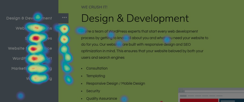
A heat map is a visual representation of how users are interacting, moving, and scrolling through a website. They use a color spectrum to identify data made up of common behaviors of users. The warmer the color the more interaction a specific area has. If there are two calls to action buttons next to each other but the left one is red while the other is blue, you can come to the conclusion that users aren’t using the other as much.
What Type Of Information Does A Heatmap Show?
There is a lot of information that can be displayed through different types of heatmaps. Each of them only adding to the amount of usable data that can help improve a website.
Scroll Map
A scroll map will show how far down users are scrolling through a single page. Using a scroll map can help you figure out where to place a call to action or if you need to rearrange important content higher up on a page if users aren’t reaching it. Scroll maps can also help figure out if long-form content is a good move for your brand and your audience. If you find that your longer blogs aren’t viewed all the way through, you might need to stick to shorter pieces.

Click Map
This is exactly what it sounds like. This map will show you any area that users have clicked on. It doesn’t matter if it’s an element that is supposed to be clickable, you’ll still get the information. How can this be helpful? If you are monitoring a page with a rather high bounce rate a click map might show that users are confused with how they are supposed to be interacting with that page. So what do they do? Get frustrated and leave. Click maps can also give you an idea if you need to make something not clickable a little more interactive.
Movement Map
Like the click map, this map does exactly what you think it does, tracks all mouse movements made on a page. This only works with desktop users, because on mobile devices there isn’t anything to track. A movement map gives you an idea of which elements of your website users might find more interesting. Are they hovering a really nice image? Or are they leaving their cursor on your map? A movement map just gives you more insight into how you can make your web pages more interactive or less complicated to use.
How Your Website Can Benefit From Heat Mapping
Heat mapping can finally add a visual component to understanding your website’s analytics and let you come up with a plan of action to make adjustments to improve the usability of your website. Heat mapping is a key component in the journey of A/B testing since you’ll be able to see the results of each change in real-time and compare them to make the best decision. There are plenty of companies like Hotjar and Crazyegg that make heat maps easy to use.
Interested In Heat Mapping But Don’t Have The Time?
That’s where iNNOV8 can help! We can go through your data so you don’t have to! Schedule your consultation with us today and we can get you back to building your business.