
Every time someone opens your website on a mobile device and it’s not responsive, a toddler punches a kitten. Okay, not really, but you are providing the equivalent as your user experience. This hurts your SEO potential, and drives traffic away from your site.
Let’s get a quick rundown on what responsive web design actually means within the context of an ordinary website. This definition from Small Business Trends sums it up nicely:
Responsive Web design is an approach whereby a designer creates a Web page that “responds to” or resizes itself depending on the type of device it is being seen through. That could be an oversized desktop computer monitor, a laptop, a 10-inch tablet, a 7-inch tablet, or a 4-inch smartphone screen.
So with this in mind, let’s take a look at hypothetical look at a website on a few different devices.
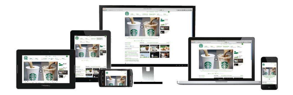
Guys…. Stop thinking about coffee and let’s focus!
Maybe the importance of this isn’t really seeping in and maybe you’re more of a numbers person… Let’s try another route.
80% of internet users own a smartphone per Smart Insights. According to MicKinsey & Company, Google says 61% of users are unlikely to return to a mobile site they had trouble accessing and 40% visit a competitor’s site instead. A report by Wolfgang Jaegel found that 91% of mobile users say that access to content is very important.
In all seriousness, it is a big deal if your site does not work on mobile devices. Think about the kittens!! And if you’re thinking, “there aren’t THAT many devices out there,” and “it can’t be THAT hard to be responsive,” think about those kittens one final time.
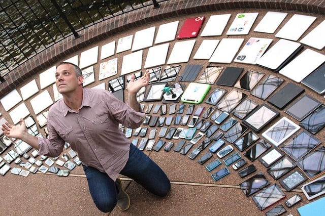
I am sure there is a number out there on the internet waiting to be found telling us how many devices are web capable, and I am also sure it’s large. Keep in mind each device is designed differently, with different software requirements, default browsers, and different hardware specs. That means, as a developer, no matter what you’re building, you will likely find yourself daydreaming of how many kittens you’d prefer were being hit in the face, while you debug the fifth CSS error you encounter in Safari, that never existed in Chrome…Sorry, that got a bit personal.
As much as I would like to believe my iPhone is having an identity crisis, that’s not the actual case. There are standards out there for web design (sometimes sketchy ones), that are intended to help developers and browsers work within boundaries that help to simplify things. And I know what you’re thinking.
Thank you, mobile gods. We’re saved!
But we haven’t quite saved those kitties just yet.
You may still be thinking, “Why do you need to know all this?”
If you’re a business owner looking to increase your audience and you haven’t taken the responsive route, that should be the first thing on your to-do list. Online shopping is already a huge trend and still growing at this rate. If you’re trying to get your blog out there over a product, what better place for someone to read that than on their device while in the restroom? I mean really… we’ve all done it…
If you’re looking to get a better return on your investment (ROI), responsiveness is another way to do that. If you do not have a fully responsive design, you are throwing away potential page views and potential dollars pulled in from your mobile shoppers.
Now onto saving all those kittens!
If you’re not familiar with WordPress or its standards, there are these things called themes. I mean, to take it directly from the WordPress Codex:
A WordPress Theme is a collection of files that work together to produce a graphical interface with an underlying unifying design for a weblog. These files are called template files. A Theme modifies the way the site is displayed, without modifying the underlying software.
To put it simply, a theme is the look and feel of your site via functionality and design. It’s the idea that you can do anything with your content within the provided templates and have a consistent and clean flow.
There are thousands of themes out there to pick from. Whether you’re building a storefront, a restaurant front, and menu, a non-profit donation location, a blog, or an educational site, there is something out there for you. There are many free options, usually offered through the CMS that’s been installed, and paid options that tend to be found via outside sources.
So get to searching for the responsive theme that fits your needs, either through WordPress or through a seller like ThemeForest. The kittens will thank you.
If you go searching and nothing seems to catch your eye (insert joke about cats chasing the red dot of doom), there are always custom themes. This is the option for businesses that are looking for a specific look or functionality that they can’t find anywhere else. Being unique can be a huge benefit to a business with the right design and implementation. This is a costlier option but usually, has a higher turn around on traffic and offers more options for Search Engine Optimization (SEO) and design tactics. Marketing teams usually love this option!
That’s it, that’s all you have to do.
As developers, we have to do much much MUCH more to make something like a custom theme or purchased theme modifications (maybe I’ll write about that in the future for all the dev-heads out there wanting to help the kitties), but as a website owner using WordPress, that’s all you have to do; find a theme that is responsive. You can look more into the Jetpack plugin to help with SEO as well (yet, again, maybe another post for the future).
So get out there and start saving those kittens! I believe you will make the right decision!
Also, if you need some emergency kittens, go here. You’re welcome.
Are you looking for a consultation? Schedule one today